Case Study: MLB BallPark
Overview
For this concept my team and I created a way to leverage the MLB Ballpark app to give game attendees the tools to better discover everything the ballpark has to offer and to simplify the process of finding and purchasing concessions and merchandise.
My main focus on this venture was the user interactive design elements, from sketching all the way through the clickable prototype. The rest of the project was work through mostly as a group.
Duration: 2 weeks
My Role: UX Designer
Tools: Sketch & InVision
✿ ✿ ✿ ✿ ✿
I. Research
During the research phase we created screeners, consent forms, and dug a little deeper into the MLB Ballpark app. We also did a competitive analysis as well as interviews.
Pain Points
The existing application is very extensive, so how would we add our feature that would both blend in with what’s already there but is also simple to find
Taking note of how MLB designed their original app, and holding onto that for later in the design process
As someone who knows nothing about baseball or Fenway park, I had to really dive into that and building up my knowledge in that field
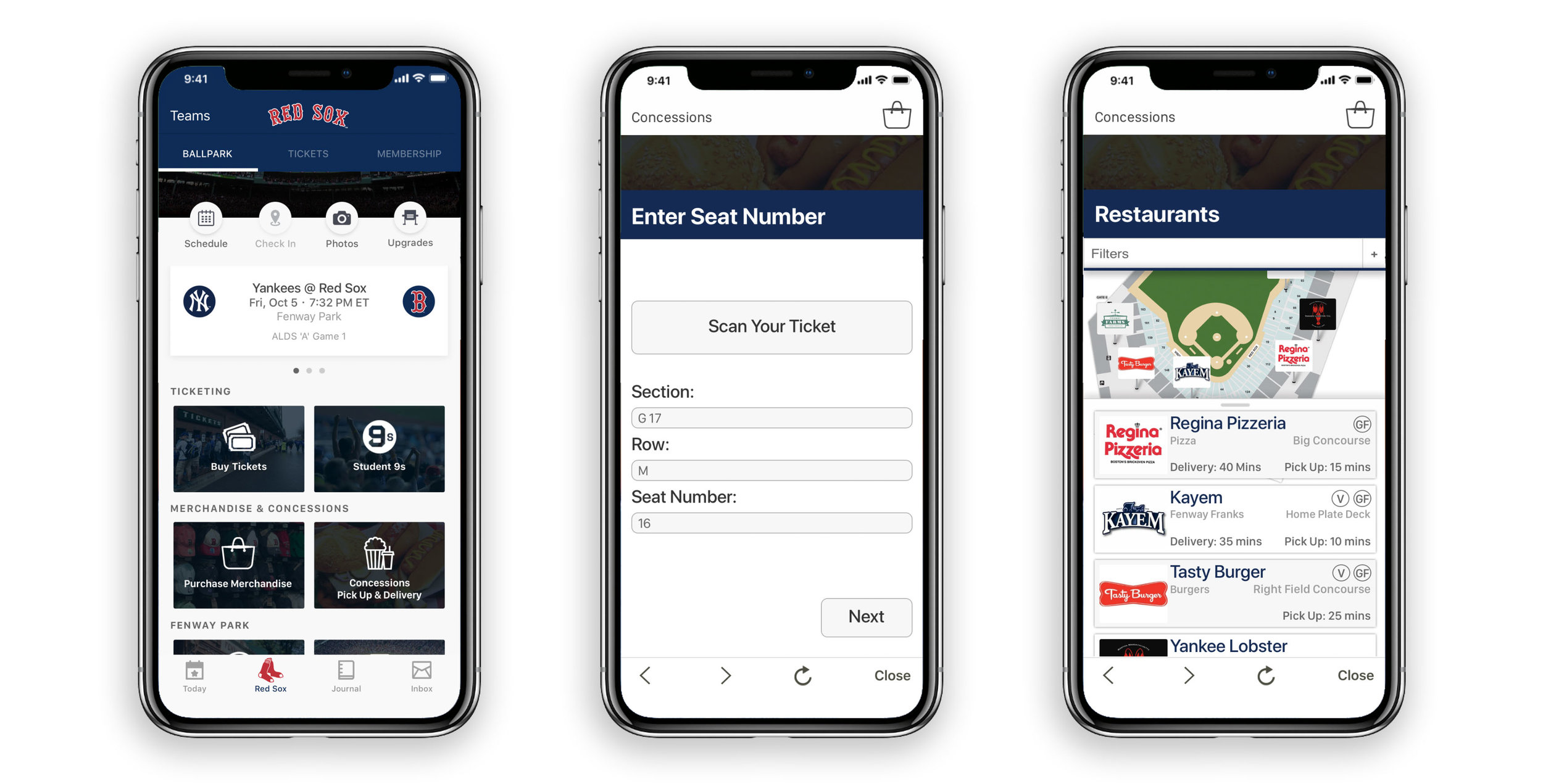
Original Application - Concessions Feature
App Map
✿ ✿ ✿ ✿ ✿
II. Synthesis
After research, we took the insights we had gathered and began analyzing it. As a team we decided to card sorting in order to identify common themes. We then took that information and built out our proto personas, as well as our problem and solution statements.
Our research lead us to make two personas, our primary and our secondary. We used those personas to consider how our users would interact with our application.
Pain points
Keeping in mind our original task while still following what the users were asking for
Maintaining attention on our feature and not getting distracted by other issues the app might have
Problem
Fenway park attendees need a way to conveniently find and buy concessions and merchandise because it’s difficult to locate all the options available.
Solution
We believe that by creating a feature in the MLB app for browsing and purchasing merchandise and concessions. We will facilitate a more enjoyable ballgame experience through the app. We’ll know this to be true when we see increased usage of this feature within the app.
✿ ✿ ✿ ✿ ✿
III. Design
In this phase I suggested that we sketch independently and then come back together as a team to discuss what worked in our sketches and what didn’t. We took our best ideas and created a new design together.
We used those sketches to build a paper prototype as well as user flows. Then we started testing with users, through the feedback that was given we were able to iterate our design. By doing user testing early in the process we were able to resolve issues that could’ve potentially become larger problems later on.
Pain Points
Remembering I am not my user
Remain open to changing your design, especially when working with a team and users where there are so many voices
✿ ✿ ✿ ✿ ✿
IV. Prototyping
We began prototyping by splitting up the wire-framing but through the process of making them I became the core person behind creating them. This was also my first time using Sketch and InVision, so there was an extra challenge in learning both what these softwares could do as well as learning their limitations.
As I started I wanted to make sure the design stayed inline with the original MLB Ballpark app. I worked to find fonts and colors, and made sure I was keeping similar navigation and similar styling to the original app.
Pain Points
Working with the limitations of softwares and finding work arounds
Coming up for air and taking a step back from what you’re doing
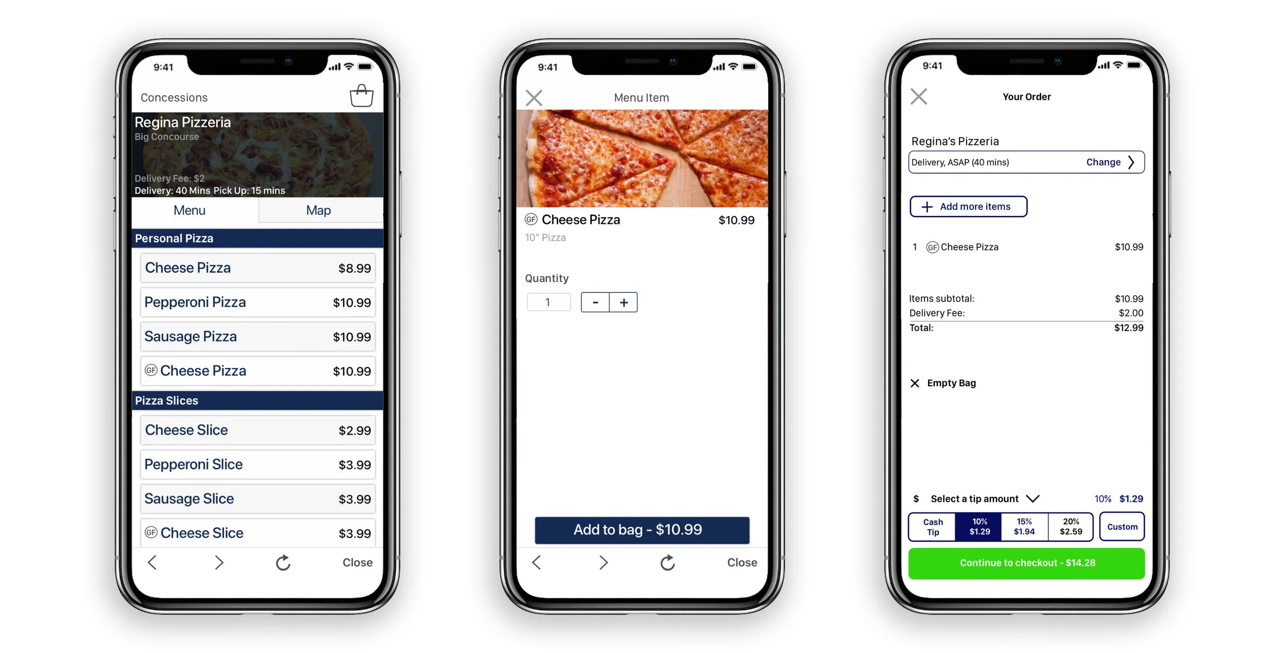
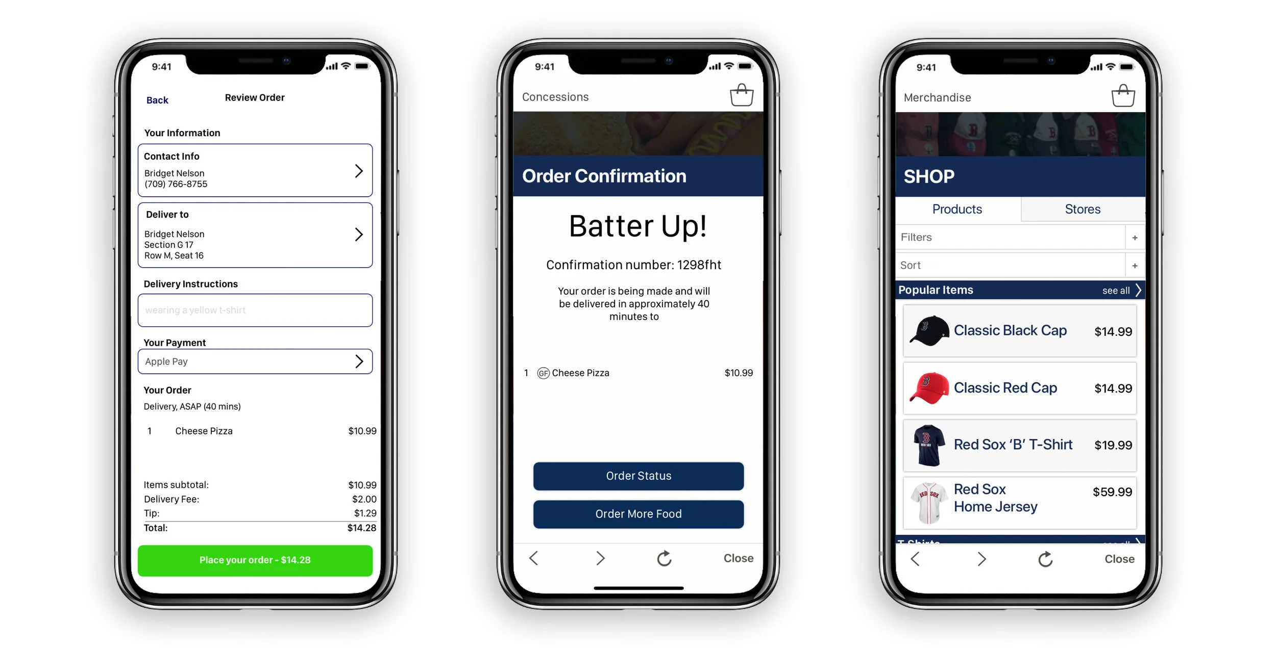
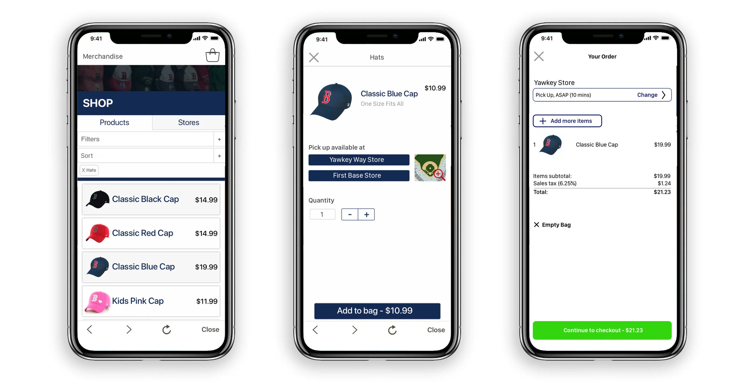
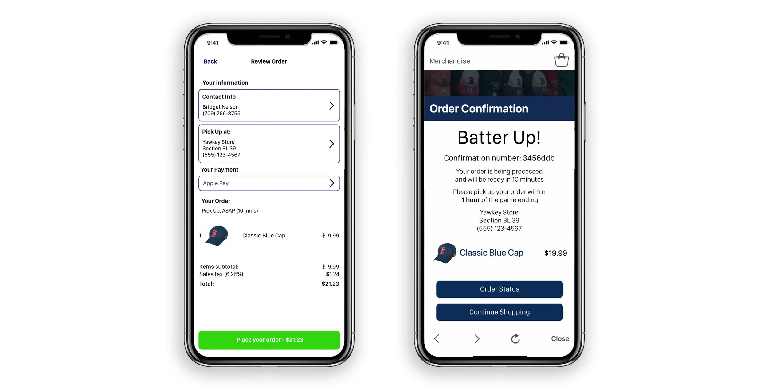
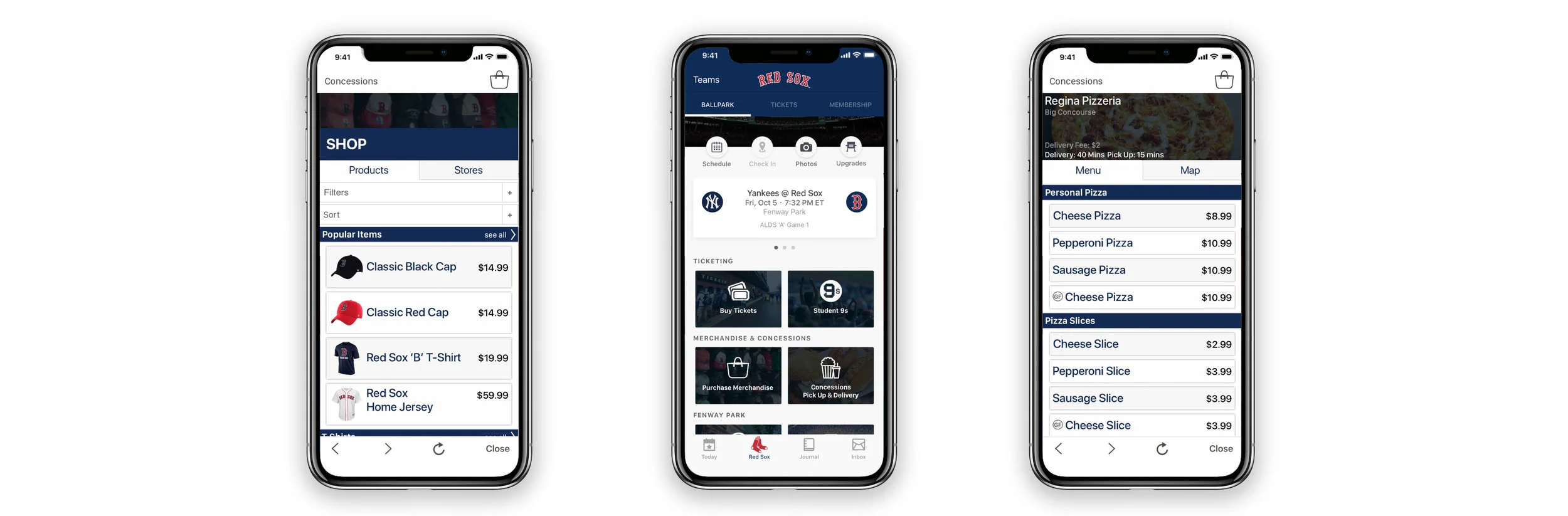
Prototype Version 1
✿ ✿ ✿ ✿ ✿
V. Testing
We then went through process of user testing and deciding how we would use that information to make changes. I then began making iterations on our prototype. We did a few rounds of user testing to really get through the kinks that our prototype had.
Pain Points
Iterate iterate iterate
There are always improvements to be made
People don’t read
Before & After
Added more ticket sections to make it less confusing
Redesigned product page
Before & After
People were confused by filter options so I changed the layout so it stood out more
Changed images to logos to options less confusing
✿ ✿ ✿ ✿ ✿
VI. The Results
After a few rounds of user testing and iterating we came to our final design. I think that we’ve achieved our goals that we set out to accomplish in the version, but I think given more time we could go in and really flesh out our ideas.
Overall Pain Points
You’re never done