iZotope
Overview
My Team and I worked with iZotope to reimagine and redesign the existing Product Portal to be the access point for all iZotope applications. We aligned the UI with current branding standards and researched ways to improve overall usability. Additionally, we also explored ways for users to access iZotope’s Knowledge Base within the Product Portal.
What is iZotope
iZotope is a leading audio-software company based out of Cambridge, MA. iZotope designs and develops world-class software and plug-ins for audio recording, mixing, mastering, restoration and more. Their products are used by millions of people in over 50 countries, and are a core component of numerous Grammy, Oscar and Emmy Award winning music and production studios.
Duration: October 2018 - November 2018
My Role: UX Designer
Tools: Sketch & InVision
✿ ✿ ✿ ✿ ✿
I. Research
During the research phase I spent a lot of time learning about iZotope and how their products worked. My team and I were given access to their suite of products to play around with.
At the same time we began familiarizing ourselves with their customer base. We started by building screeners as well as doing interviews.
Pain Points
Product Portal has problems around usability
iZotope’s branding and style is not the same on Product Portal
The process to install, authorize and update your existing iZotope products could use improvement
There are no tools, guidance or resources for learning how to use Product Portal
✿ ✿ ✿ ✿ ✿
II. Synthesis
We conducted over twenty interviews with people who had used iZotopes software. I thought the best way to synthesize these findings would be through affinity mapping.
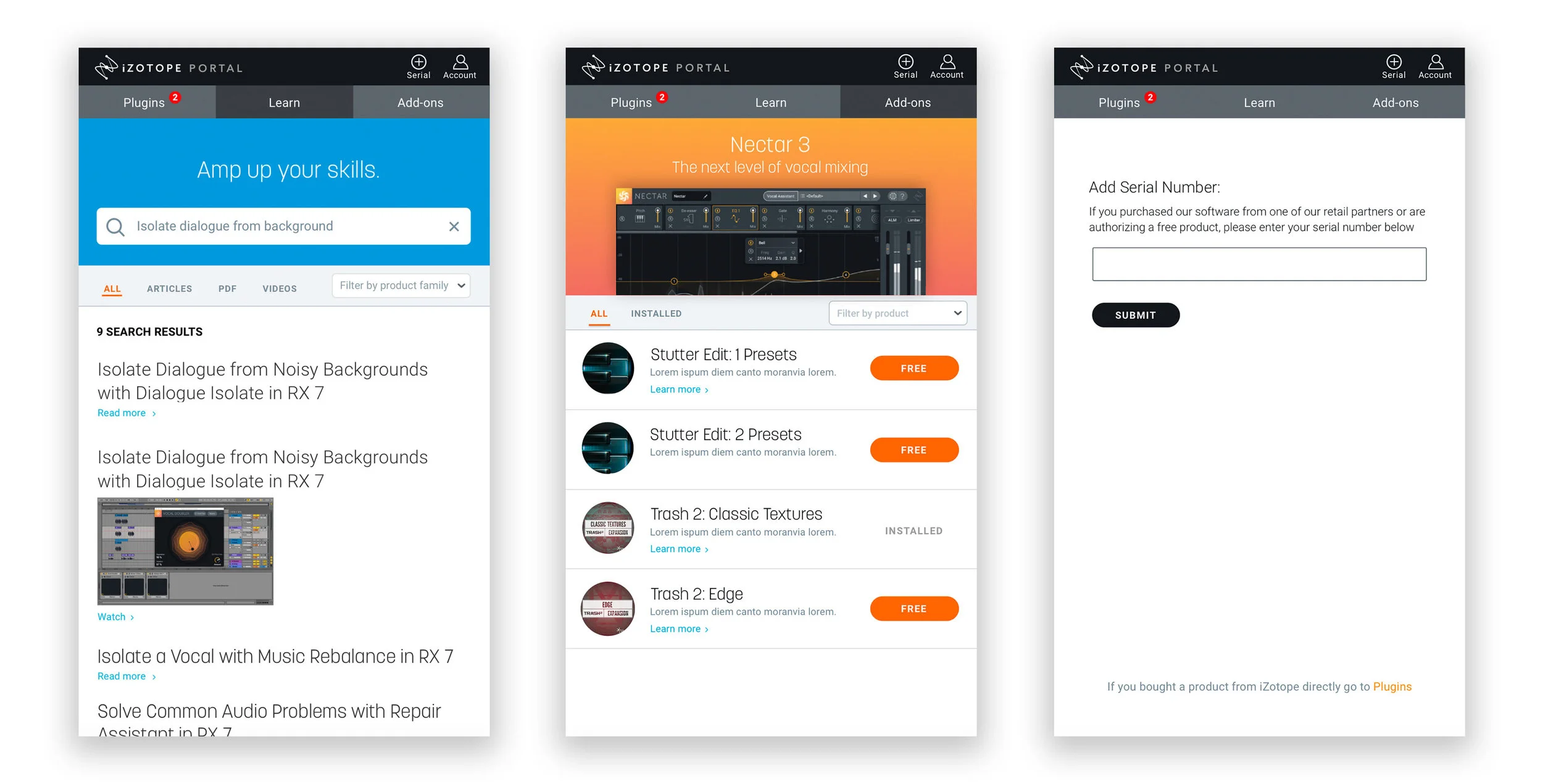
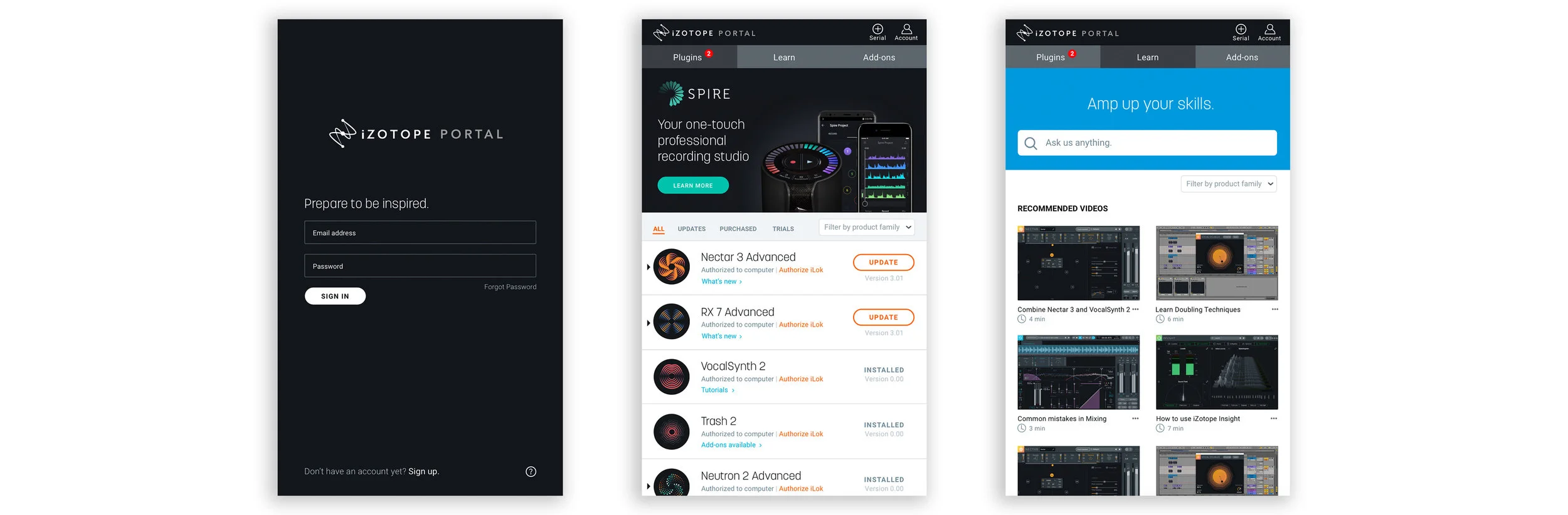
After combining the insights from our research I decided it was important to include search bar, as well as include relevant issues or product specific questions in our Knowledge Base.
Takeaways
Users typically look to Google or YouTube when they need help learning software
A knowledge base could only replace a Google search if the user knew the information they were looking for was going to be in the knowledge base
We also found that users wanted a system that was easy to navigate
Problem
iZotope users need a better way to manage, authorize, purchase, update and learn more about their various software products and plug-ins, regardless of their knowledge level or experience creating music.
Solution
By re-designing iZotope’s Product Portal with improved usability, visual design and overall ease-of-use, users will have far more control when it comes to managing their suite of products and gain access to critical resources such as a knowledge base, installation guides, and detailed product information.
With Product Portal serving as the entry point into iZotope’s ecosystem of innovative audio products, the company will strengthen its relationship with existing customers as well as attract new users through its enhanced digital experience.
✿ ✿ ✿ ✿ ✿
III. Design
We began by breaking up and sketching individually before coming back together. We really wanted to work through our different ideas on paper, that way when we began working in Sketch we would be working towards one goal.
I wanted to stay consistent with iZotopes design and UI standards. While we were building, I was the driving force behind keeping the rest of the team on track.
Pain Points
Providing information the user needs to know before they install a plug-in
Anticipating information the user would expect to see when looking for a knowledge-based answer
✿ ✿ ✿ ✿ ✿
IV. Prototyping
After building out the screens we began testing. I built a few different prototypes so we could test different screens and figure out what worked best.
Pain Points
Continuously looking back over each others work to make sure it all followed iZotopes style and UI standards
Remaining neutral and letting the user speak for what they wanted
✿ ✿ ✿ ✿ ✿
V. Testing
To see if our design worked in we performed user testing of our Hi-Fi Mockup on those we had interviewed. We provided a scenario and users talk through their process as they went through Product Portal.
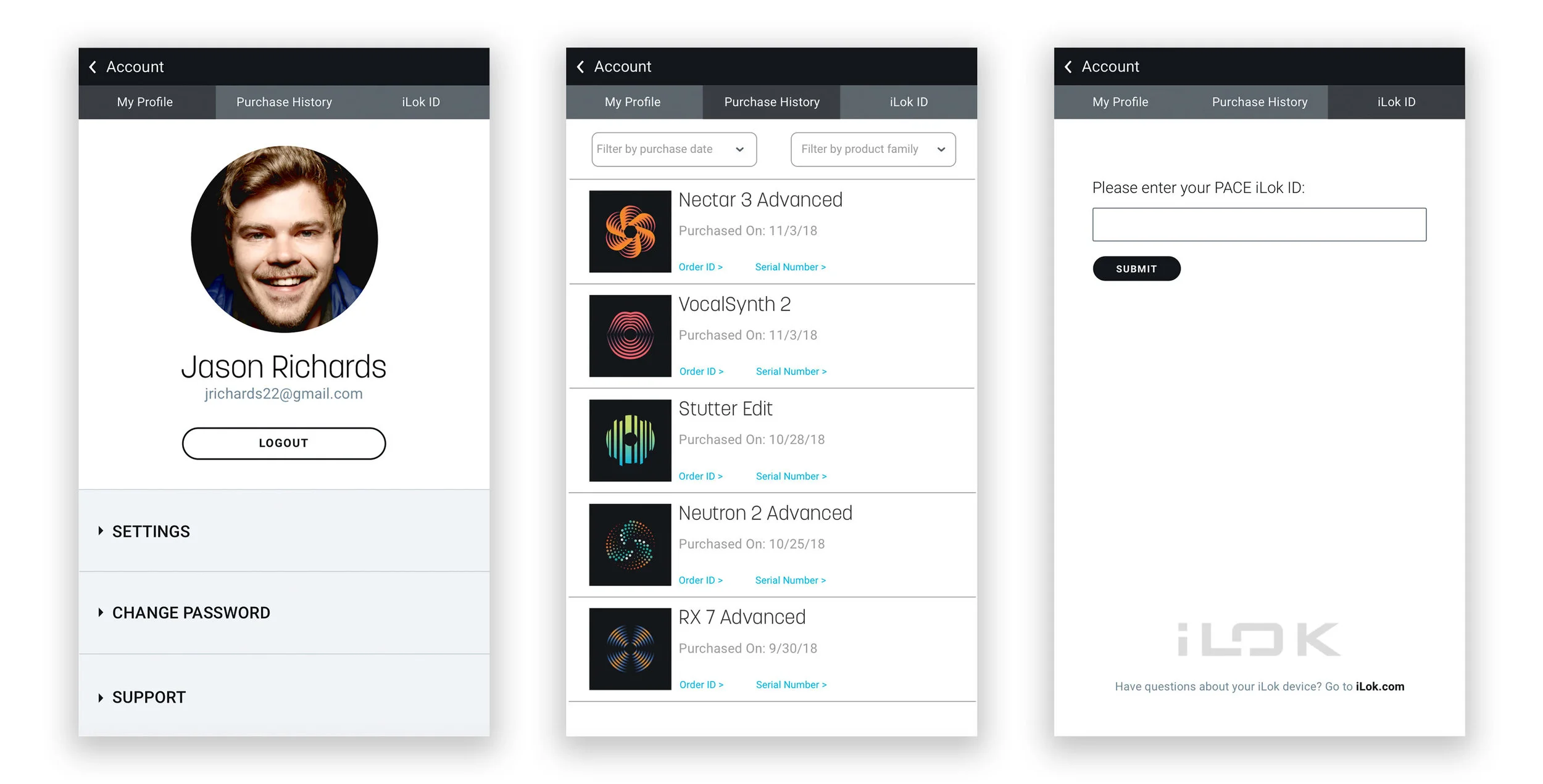
Some of the bigger changes we were simplifying our knowledge base tab to a learn tab. We combined our search bar and relevant information below it. We also went from four tabs down to three.
✿ ✿ ✿ ✿ ✿
VI. The Results
At the end of our project, my team delivered a presentation to a small group of designers from iZotope. They thought the redesign had been very well thought through and designed well. We will be presenting to the rest of the company in January.
It was very exciting to work on this project, and I’d love to continue to do so. I’d like to spend more time digging deeper into the learn tab and working through how to organize the information architecture.